Pakistan Crop Yield × Climate
Interactive dashboard and regression study relating two decades of provincial climate data to crop yields across Pakistan.
Problem
Pakistan's agriculture employs a third of its workforce, yet the public conversation about climate impact on harvests runs mostly on anecdotes. This project asks the question with data: across 20+ years of records and all four provinces, how do temperature and rainfall trends actually correlate with yields of the major crops. Can climate variables alone predict yield well enough to be useful?
Architecture
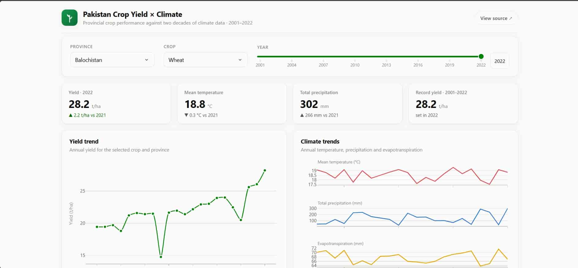
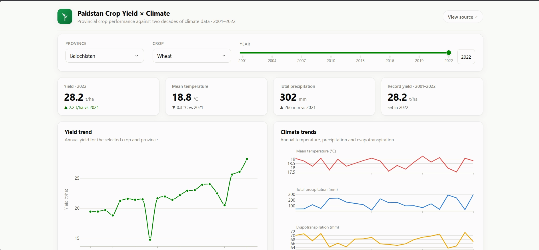
Decades of provincial climate records (temperature, rainfall) are joined with crop-yield data in a pandas pipeline that handles unit mismatches, missing seasons, and inconsistent province naming. The cleaned panel feeds two consumers: a regression model predicting yields from climate variables (R² = 0.94), and a live Plotly Dash dashboard with six linked visualizations and real-time filtering by province, crop, and year range, deployed on Render.
Tech decisions & trade-offs
Why regression with statsmodels alongside scikit-learn
The goal is explanation, not just prediction. Scikit-learn gives the predictive pipeline, but statsmodels reports coefficients with confidence intervals and p-values, which is what turns "the model fits well" into a defensible claim like wheat yield in Punjab falls measurably as growing-season temperature rises. The trade-off is doing the modeling twice in two libraries; the payoff is numbers you can put in front of someone skeptical.
Why an interactive dashboard over static charts
A static report answers the questions the author thought of. With four provinces, multiple crops, and two climate dimensions, the interesting questions are combinatorial. Six dynamic visualizations with cross-filtering let the viewer chase their own hypothesis (cotton in Sindh vs. wheat in Punjab) instead of scrolling someone else's. Dash keeps the whole stack in Python, so the analysis code and the presentation layer share one language and one set of dataframes.
Why Render for hosting
The dashboard is a long-running Python process, not a static site. It needs a real server. Render's free tier runs it with zero ops work, at the cost of cold starts after idle periods. For a portfolio analytics app, a 20-second first load is an acceptable price for a permanently shareable URL.